App design learnings from our experience
We are designing for truck drivers. Plumbers. Electricians. Mechanics. In addition to office workers, home-makers.
In fact we have no idea who could be the next user for Simply C2.
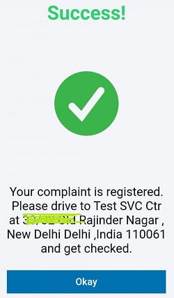
For those who do not know, Simply C2, earlier called Grahak Setu, is an app for customers to log complaints directly with manufacturers.
Our CRM users are sophisticated business users. Designing for them did not prepare us for designing for “unsophisticated”- yes, the quotes are deliberate- users.
Here are a few of our app design learnings.
Simple is beautiful

The number one on the app design learnings list.
Simple is minimal. Minimal is what you need.
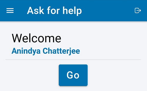
Our target users are busy. They do not have the luxury of waiting to figure it out. Also, they come to the app to do one simple thing.
Make that task stare at them.
B2B is hard to design for
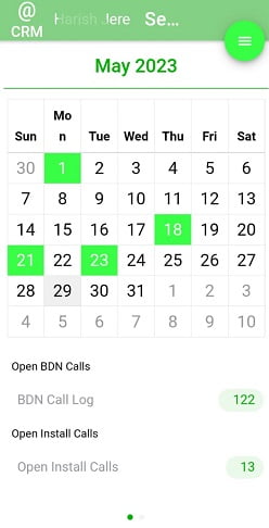
The same app can be used by multiple users at different levels. While the boss may want aggregation and reports, the traveling salesman/ service technician may just want to see tasks for the day.
What we worry about every day. Saleswah CRM tests our ingenuity every day.


The solution is not to show the charts to the technicians or even the entire ticket closure workflow to the managing director sitting in the office. We must be able to present relevant and role-specific views and workflows to the users.
Doing that in the same mobile app, in the same UI and ensuring great UX is hard. Very hard.
Core set of target users with core set of functionality
Every app has a target persona. How you choose to define the target persona while designing the app and the workflows, will influence the usage and adoption.
We need a lot of users. But, first it needs to be useful to a core set of users and they need to find it useful. Really useful. And helpful.

Some of the users will say good things about your app. And, maybe start a virtuous cycle.
Doing this in B2B apps is hard.
Because the boss decides. But he does not use.
Sometimes words speak louder than pictures
Sometimes as designers we get carried away. With icons, pictures, mnemonics. And we forget that we are part of an echo-chamber of app developers and software nerds.

So, if that floppy disk sign for “save” does not make sense to your target audience, please use the word “Save” instead. Sometimes what you lose in “aesthetics” can be more than made up in comprehensibility.
Localize, localize, localize
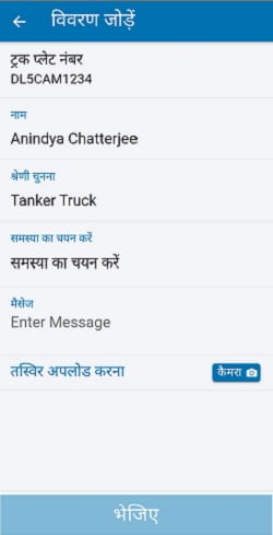
Start with translating the menu and the instructions. If your app is targeting a diverse geography and demography not very fluent in English, you have to do this. The best example in the Indian ecosystem of this is KhataBook. They have used localization as part of their design strategy- from day one.

Clearly one of the most important app design learnings.
Saleswah CRM is in 4 languages. Simply C2 is in 2. But, we are expanding our repertoire.
Sometimes, customization is the only way
This is especially true in B2B. Because in B2B segment, each customer will have a different customer facing process.
Sometimes they are able to let their customer facing process work with Simply C2. It depends on their perception of the ease of adoption of their target customers.
But, many times they are not. We have no choice then to re-build the Simply C2 process around UI/ UX that speaks to their clients.
Like we built for Initiative Water, a pioneering company based in Pune, India. Initiative innovates in the space of Multi-port valves, Water ATMs and Dosing Pumps and uses Saleswah CRM to manage their customer service centres across India. Their version of the customer facing app, the Initiative Grahak Setu is custom made for their customers alone.
They use the data they log from the customer interactions to tweak and expand their service network.

